ABOUT THIS PROJECT
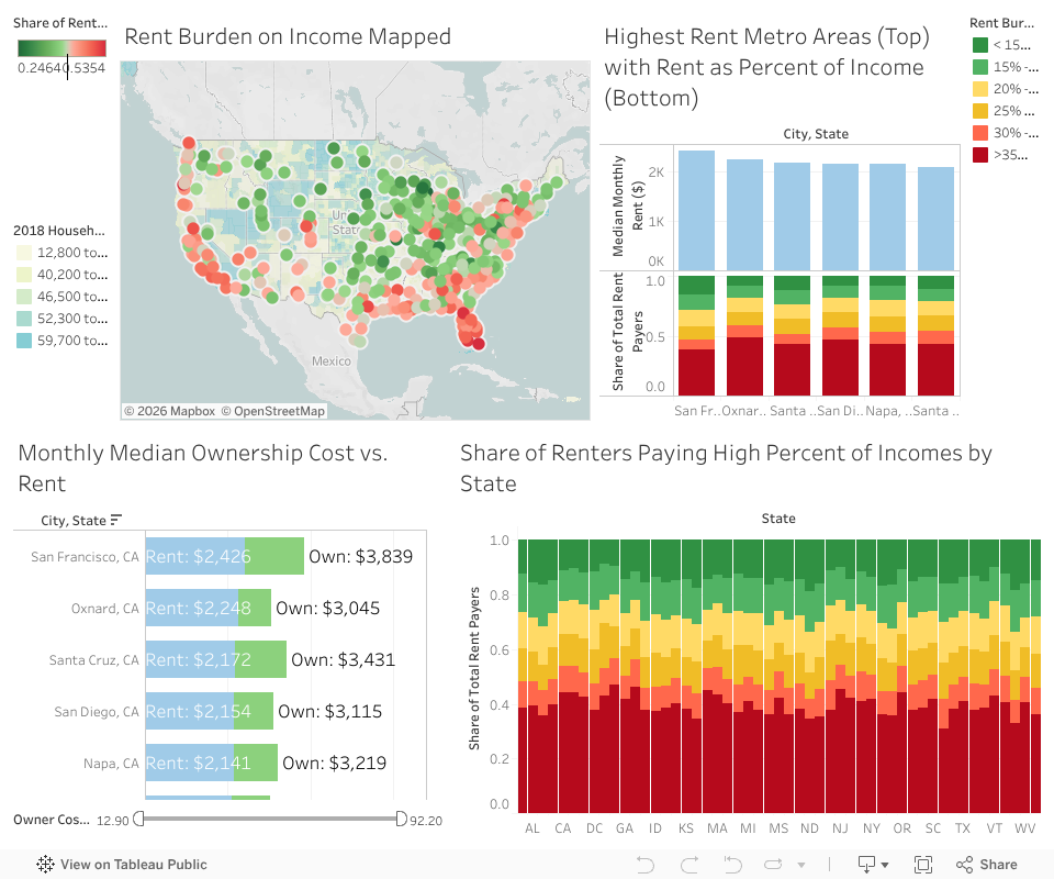
How can we quantify housing affordability?
This is my personal exploration of the economics of housing, comparing data from across geographic regions, especially in the United States.
My analysis accomplishes three main objectives:
- Sheds light on the global scale of housing affordability challenges
- Quantifies the financial impact of home prices across different income levels
- Offers a comparison of housing affordability between major U.S. cities, accounting for income differences

This project began when I found publicly-sourced housing data on Numbeo that revealed a surprising pattern. While U.S. home prices are generally high compared to other countries, global price-to-income ratios told a different story. Because Americans earn higher average incomes, U.S. cities consistently ranked among the most affordable when measuring cost relative to income.
Though publicly-sourced data has limitations, the pattern was too clear to ignore. I decided to investigate how income differences might change the typical narrative around U.S. housing costs.
Key Insights
- Housing unaffordability is a global challenge, not uniquely American
- Income differences significantly impact housing affordability—moving to an expensive city becomes manageable with higher pay, while cheaper cities lose appeal if wages drop
- Housing supply depends not only on policy and zoning, but also on broader economic health and stability at a local and national level
Interactive Dashboard
Select cities on the map (Ctl + Click) to compare affordability based on the share of income people pay on rent (top right) and extra cost of ownership (bottom left).
Methodology
STEP 1
Data Sourcing
US Census Data
- American Community Survey: Selected Housing Characteristics 5-Year Estimates, Total Population 5-Year Estimates (2013 – 2023)
Global Home Pricing Index
- Numbeo: Property Prices Index by City (2025)


STEP 2
Cleaning & Formatting
After collecting all the required data, I took some additional steps to prepare this data for analysis:
- Created a script to combine datasets from different periods into a single table with years appropriately labeled
- Added calculated fields to further enrich the data
STEP 3
Analysis & Visualization
Finally, I identified key metrics and comparisons that revealed interesting patterns and shed light on the questions I wanted to answer. After creating the charts, I connected them together to tell a coherent story.

ADDITIONAL RESOURCES
Here are some great articles and charts on this topic!
In this project, I've focused on some very specific metrics, and there are many others to consider when making financial and policy decisions related to housing. These resources offer further insights if you're interested in exploring this topic.
- Charted: U.S. Median House Prices vs. Income (Visual Capitalist)
- Mapped: Home Price-to-Income Ratio of Large U.S. Cities (Visual Capitalist)